kelvin
Branding
Marketing Materials
Located at the heart of Lemon Grove lies Kelvin, a curated collection of artistically designed apartment homes. AFMKTG embarked on the mission to craft a comprehensive branding guide that beautifully encapsulates the contemporary and welcoming essence of Kelvin.
Kelvin’s brand logo feels modern and elevated, yet approachable. Intentionally designed with the kelvin unit (K)—the primary unit of temperature in the International System of Units—in mind, the logo honors the lowercase writing style of kelvin while simultaneously elevating it by introducing mixed-case letter alternatives. The hybrid logotype evokes confidence and boldness, as well as reliability and comfort—the perfect blend of casual luxury.
The pairing of a thicker, expanded (slightly wider) san serif logo font with the complementary san serif tagline font, gives the logo lockup just the right amount of strength and edge while reinforcing the feeling of trustworthiness, making the brand feel established and desirable for a renter..
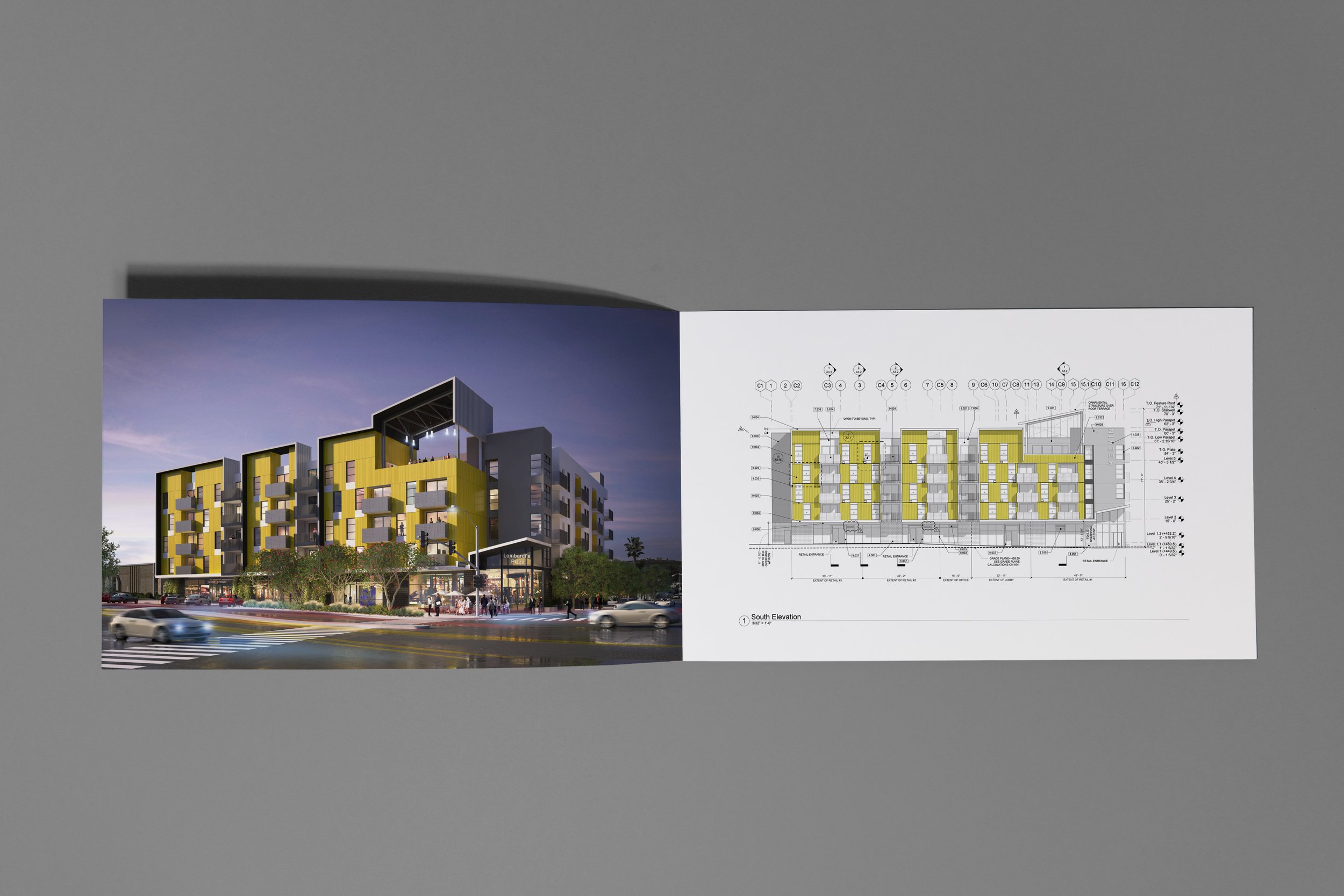
The color palette spans the spectrum of the kelvin color temperature scale—from warm reds, oranges and yellows to cool blues, in addition to neutral greys. The primary colors, yellow and gray, not only harmonize with the building's exterior but also radiate warmth and hint at the brand's thoughtful and stylish character.
By leveraging branding, signage, and compelling renderings, AFMKTG's creative expertise not only breathes life into the project's fundamental vision but also guarantees that Kelvin evolves into a modern and irresistibly welcoming destination.
Photography provided by Haley Hill